I discovered a bit of a trend when looking at photographer’s websites as part of this week’s task. It seems that a lot of my favorite artists have the same format, small summary menus on the left and then gallery as the rest of the webpage. Pretty clean looking and straight to the point…
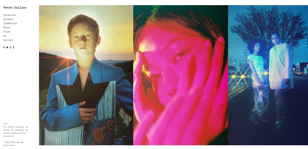
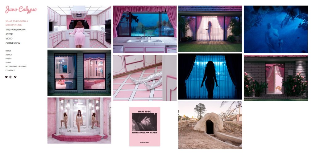
This format is good for a first impression as well as being able to easily navigate different projects as well as commercial/editorial campaigns.
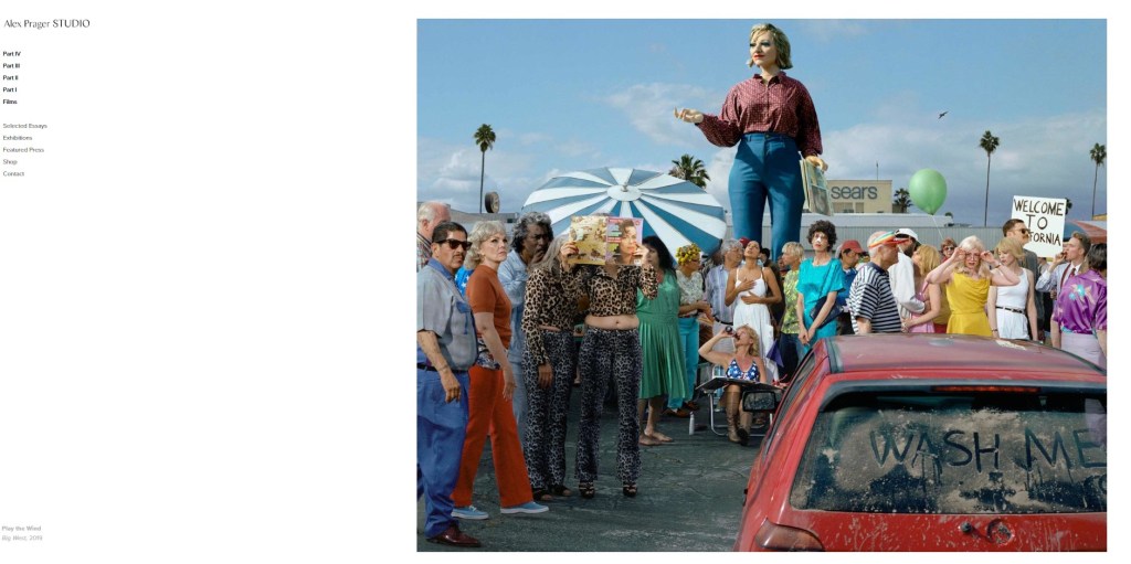
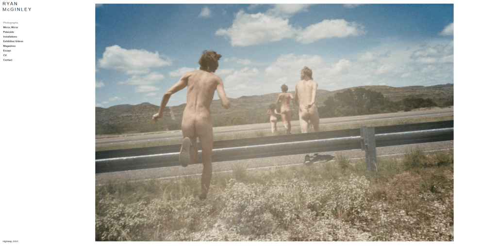
I feel that the simplicity is key for the layout. You don’t have to scroll anywhere to see an image, the interface is literally one or two clicks to go from homepage to a gallery and its all very clean looking.
Compared to my site below…
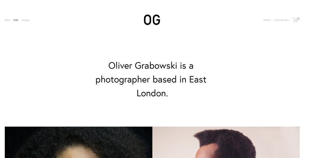
ogphoto.co.uk
First thing I need to do is get rid of the three options and the tag line. As you can see, it doesn’t fit on one page!
I also want to divide my menus up into projects and commissions (paid jobs). Basically I am looking for a squarespace template that looks like the other sites above.
I think whilst it would be great to have minimal information and make a more intuitive site, I am very much an unknown so I don’t know if it is still important to have some kind of information that lets someone know what I do. I guess I will just have to look at it and decide.
