Who’s Afraid of Magenta, Yellow and Cyan?
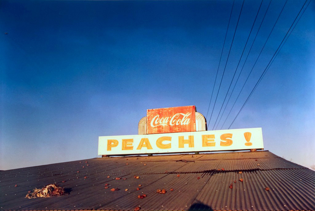
As a colour photographer always seeking out inspiration for colour palettes, processing or grading, William Eggleston is one of my favourite users of colour. The vibrance and high saturation of colour in his work really adds to the dynamic of what is presented often adding to the sense of mystery in the images. This article by Anna Kerrer Kivlan for American Suburb discusses Eggleston’s use of colour in and a time where black and white was the accepted standard and his colour process.
“There are four simple words for the matter, which must be whispered: colour photography is vulgar.” Walker Evans, Quality: Its Image in the Arts, 1969
Before the success of William Eggleston’s 1976 exhibition at MoMA the use of colour film in photography had been distinctly considered as something for the amateur photographer to take family photographs or snapshots with.
“Colour film was, at the time, inseparably associated with magazines such as Life and Vogue, with television, Super 8 home movie cameras, and Technicolor movies. Colour film was not the medium of the fine artist. It was better suited the director of raunchy, sex-and-violence-crazed double features shown at the local movie theatre” Anna Kerrer Kivlan – 2015
Colour photography has always been much more interesting and vibrant to me than black and white, I know this is a case of personal preference however I try to avoid black and white photography when working either for clients or for myself. I don’t discount black and white photography, there are masterpieces in black and white and I can understand one’s willingness to shoot it as it is cheaper and easier to process black and white film yourself than with colour film.
Another thing that interests me about this piece on Eggleston is where the qualification on his photographs becoming art:
“he stopped printing himself after he began shooting in color. Only a dedicated specialist could do the job. The expense, level of skill, and rarity of the dye transfer process rendered Eggleston’s images unattainable for the average person with a Polaroid camera. Thus, despite their apparent similarity to the snapshot (and the critical reaction such a similarity fueled), they were “art” indeed”
The influence of the printing process, and the elitism of the dye transfer process adding to the credibility of the images as art is a truth that I find hard to swallow but the fact of the matter is that these processes made the images what they were. Without employing the expensive treatments to the image, the colours would not burst out of the photographs the way they do.
What is certain is that the influence carried forward from Eggleston’s work is visible more than ever in digital imaging. Colour filters for camera phones, for image processing software has made the dye transfer process available to everyone and Eggleston’s photographs would sit alongside and of the ‘cool’ or trending images seen regularly on photography pages on Instagram. There are so many photographers today that are emulating his style whether they know him or not.

References

Kerrer Kivlan,A. (2015)William Eggleston: Who’s Afraid of Magenta, Yellow and Cyan? on ASX: https://www.americansuburbx.com/2015/07/william-eggleston-whos-afraid-of-magenta-yellow-and-cyan.html

William Eggleston, Untitled (Peaches!) 1971:https://artblart.files.wordpress.com/2013/07/peaches-web.jpg

Untitled, William Eggleston (c.1966-71): https://www.telegraph.co.uk/content/dam/luxury/2019/03/05/Eggleston-1_trans_NvBQzQNjv4Bqoe5-EbBW9bAh1lhS6qXM5pjAfLgryD9l4Tk_PMMvKTo.jpg?imwidth=450


William Eggleston, Untitled (Dolls on Cadillac), 1973–1973: https://www.americansuburbx.com/wp-content/uploads/2015/07/5188814181_9e1f2eb017_b.jpg
